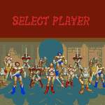
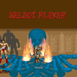
Original select screen in Golden Axe Remake was functional, but insufficient for needs of Golden Axe Hackjob. Primary concerns were the following:
- Main selectable characters each having to accommodate for the others colors within their palettes. This severely limited color choices. For example, Ax could not be given the 2p color palette from Golden Axe The Duel. Doing so required changing his weapon colors, which were shared with Tyris Flare’s clothing.
- No true carousel effect. While characters were displayed in a ring, they simply swapped location when cycled instead of rotating as in the arcade original.
- No name display. At no point are characters ever identified. While not a great issue for the the original characters, this is a problem when introducing others.
- No accommodation for extra characters. It would be rather jarring and unprofessional looking for alternate choices to be inserted into selection cycle when not appearing in “ring” of visible choices.
- Non selected characters are “burned” when a choice is confirmed. The fire effect used lacks transparency and thematically does not match the various improved effects used throughout the module.
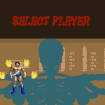
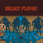
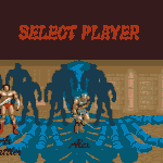
To solve this problem, I decided to use a series of blank silhouettes to serve as the carousel. As characters are cycled, the blank silhouettes rotate in place, then the front silhouette is replaced by current selection. This would allow infinite addition of selectable characters while maintaining the theme.
The original plan was for the silhouettes to be displayed by a separate entity, with rotation direction determined by left/right key press. Unfortunately scripted spawns during the selection screen results in a shutdown. Attempts to make use of the summonentity/spawnentity command also proved unsuccessful; during selection screen these commands are ignored.
This only left having the silhouettes be part of main entity. Main issue was adding a color for the silhouettes to characters with palettes firmly established. I worked around the problem by using the entry 255 in each character’s palette as the silhouette color. In addition to getting around the laborious process of “inserting” a color to existing palettes, it also meant only the palette images needed modification as opposed to every single sprite.
Having the silhouettes displayed within main entity also solved any timing issues, though it did mean rotation would always be in same direction. I was worried unidirectional rotation would look jarring, but in practice it works quite well. The rotation itself is achieved by a “brute force” approach; a series of sprites drawn to give the illusion of a carousel are played as part of the “wait” animation. The memory consumption is minimum however, as the rotating silhouette sprites are reused by every selectable character.
Name display is also part of the main entity, and its color issue was solved in the same manor, except with use of color entry 254.
The burn effect was the last problem to overcome, but was easily solved. It is achieved by launching a non moving projectile on selection confirmation. While it would have been impossible to use this method for the silhouettes due to timing issues, it works perfectly for burning and allows use of transparency.
As a last touch, the location of each character was widened for more room and player 1 was placed in the center (this module allows 3 players). Player 2 is on the far left, player 3 on the far right. Along with improving aesthetics, by making these changes I have added yet another obstacle to any short sighted attempts at Dreamcast porting.
2 Comments